Sunday, April 30, 2023

Mother, I Love You

Hello!  With May about to begin, my thoughts have turned to Mother's Day.  

When I was little, there were a few songs we used to sing at church around Mother's Day.  One started with "Mother, I love you..." and another had the line "Dear mother, all flowers remind me of you." I always think of those songs this time of year, and I decided to use them as the theme for my card. 
To make a card with lots of flowers, Pretty Pink Posh's Floral Background Stencil seemed a good place to start.  I blended Concord & 9th's Sweet Pea ink lightly on the card base, and then again with a little heavier hand through the stencil.  
A couple weeks ago I shared a card using Pretty Pink Posh's Floral Corners stamp set.  It reminded me all over again how much I loved it, so it's making another appearance today.  I embossed two of the floral sprays and colored them with Zig clean color real brush markers.  I die cut them with the coordinating dies and placed them on the second largest Wonky Stitched Square.
For the sentiment I used the Mother Shadow Dies. I added a secondary stamped sentiment from Simple Sentiments using Grape Soda ink
I can't help but smile when I look at this card because it reminds me of my mom.  I love creating cards for the people I love dearly!

Thanks so much for visiting today!  I hope you have a blessed Sunday!

Friday, April 28, 2023

Flowers Great and Small with Concord & 9th

Good morning, friends!  I cannot believe it, but April is swiftly coming to a close.  Today I'm sharing my last official post using Concord and 9th's April Color Release.  It's been the happiest month with SO MUCH color.  I hadn't used a couple of the products releasing this month yet, so I combined them on this card.  And I'm happy to report that both the Flower Press Stencil Pack and the Triple-Step Posy Stamps are in stock, so you can still pick them up. :) 

One of the things I was really excited to see with the new color release was an expansion of the purples.  For today's card I used two new colors--Lilac and Fig-- and paired them with the previously released EggplantOceansideSprout, and Parsley.

There have been lots of beautiful cards shared using the Triple-Step Posy Print Bundle in the more traditional way, so I decided to go a little different direction.  Every time I looked at those dainty little posies I would think of butterflies, so I decided to use them to use them on a butterfly.   Concord and 9th's Whimsical Wings Dies worked perfectly for this.  

I stamped two panels with the Triple-Step Posy Stamps in LilacFigSprout, and Parsley.  Then I cut them out with the Whimsical Wings Dies.  I also cut a second set of upper wings in Fig to layer behind and used one of the layering dies in Oceanside to add detail to the lower set of wings.  If you look closely, you can see that I also added a few Lilac and Fig Enamel Dots to the posies.  They match the colors really well! I cut the butterfly body in Eggplant and then cut a few of the posies with the Triple-Step Posy Dies to create eyespots on the butterfly wings. 

I used the Flower Press Stencil Pack to create the perfect floral background.  A couple things about this stencil...First, I love it more and more every time I ink it up.  Second, the stencils themselves are noticeably thicker than other stencils I have used, and they are REALLY easy to work with even in tiny detailed areas.  Third, there are four stencils, but the images are large enough and spaced far enough apart that it is easy to add extra colors like I did here.  (I used all 6 colors in my color scheme.)

The final step on this card was a sentiment from the Triple-Step Posy Stamps stamped in Oceanside ink.  Thanks so much for joining me today and all this month!  It's been a fun one!  I hope I've been able to inspire you. :) 

Friday, April 21, 2023

Concord & 9th Triangle Background Fun

Hello, and happy Friday!  Today I'm joining Concord and 9th to feature their new Triangle Background Dies.  I had SO many ideas on how to use these dies, but then the amazing Jennifer McGuire did a video using them, and it turns out that she also had thought of the majority of my "clever" ideas.  Lol.  SO I went back to the drawing board and tried to think out of the box.  And this is where I landed...

What do you think?  I'm a big fan of geometric landscapes.  There is something amazing to me about being able to simplify things down to their most basic shape and then letting color complete the picture.  I was inspired by lots of pictures on Pinterest, Etsy, and an art piece that Bed, Bath, and Beyond used to carry, but I believe the piece originated with The Old Art Studio.  

I pulled out my color swatchbook and chose the color combination of Eggplant, Briar RoseNectarSpiced Cider, and Juniper.  I just love these earthy tones!  

I used the two triangle strips included with the Triangle Background Dies, and cut a pile of each color.  Then, I used the coverplate die to guide where I placed the triangles.  The angled lines worked perfectly for this design, and it was quite therapeutic to just sit there and glue down the little triangles. It was like those color by sticker or diamond art kits that my kids enjoy so much.

I finished my card off with a sentiment from the new Triple-Step Posy Print Dies. I couldn't believe how perfectly the slant of the "hello" matched!

My next card started with one of my favorite color combos that I made for my swatchbook--Nectar, GrapefruitDragonfruitCarnationAqua Sky, and Oceanside.  I loved it and knew it had to be made into a card.  
Of course, I ended up adding 3 more colors (Peacock, Dove, and Mushroom) before it was all said and done, but you know...
One of my favorite sources for inspiration for the Triangle Background Dies is quilt patterns.  I didn't follow any particular pattern on this card, but the idea was sparked by some quilts that I saw. 

The sentiment on my card comes from the Everyday Sayings Dies.   I just love them!

Okay, last card. :) This one was completely unplanned.  The triangle strips in the Triangle Background Dies cut mostly full triangles, but some half triangles.  I didn't use any on my previous card, so when I was finished I pushed them all aside into a pile.  I glanced down at the pile and LOVED how it looked.  Then I saw the negative "hi" die cut and the rest is history. 

All I did was cover a square with glue, stick the pile of discarded triangles down on it, and place the negative cut on top.  Simple, quick, and completely made of scraps...win, win, win! 
Yeah, I'm still smiling about it. :) Wait, confession.  I did strategically rearrange the Dragonfruit and Peacock triangles just a bit to balance out their dark colors.  Okay, I feel better now.  

Thanks so much for joining me today!  I hope I'm leaving you smiling to go into the weekend! :)

Wednesday, April 19, 2023

Floral Corners Thank You

Hello, friends!  It's been a busy crafty month, and I haven't had a chance to share some of the cards I've made.  The craft world is always coming out with amazing new products, but I've been wanting to revisit some of my older favorites, so that's what I did for today's card. :)  
I pulled out Pretty Pink Posh's Floral Corners Stamp set and embossed two of the images in white on Bristol cardstock to create a frame. (This is such a pretty set!) Then I dusted off my zig clean color real brush markers and colored the flowers. 
Next I layered several Thank You Script dies for my sentiment.  
I really wanted to keep things simple, so I trimmed my panel down, adhered it to a wheat card base, and called it a day.
Thanks so much for stopping by to visit!  I hope you are having a wonderful week!

Friday, April 14, 2023

Concord & 9th Swatch Heaven

Good morning, friends!  For the past couple of weeks I have been in Swatch Heaven, swimming in colors, and totally loving every minute of it.  Except for maybe the photographing part. That was tricky!  I was determined to keep the colors as true as I possibly could....but I digress. 

Here is a view of what I used to pull everything together and what I've been looking at the past couple weeks.  It still makes me smile. :) Concord and 9th has everything you need to pull it together.  Even the binder rings!  The Swatchbook Bundle is my new favorite thing...
Let's get started!  First up the cover.  I used the Swatchbook Stamp Set (love the big, bold letters!) as well as Hello, Lovely, which is an old favorite of mine.  These flowers stamped in the ombre color design is a nod to a favorite set of cards I made for Concord and 9th's first color release. (You can see the set here.)  To this date, it's still one of my most loved projects, and I couldn't help but sneak it in again.  It seemed fitting. :) 
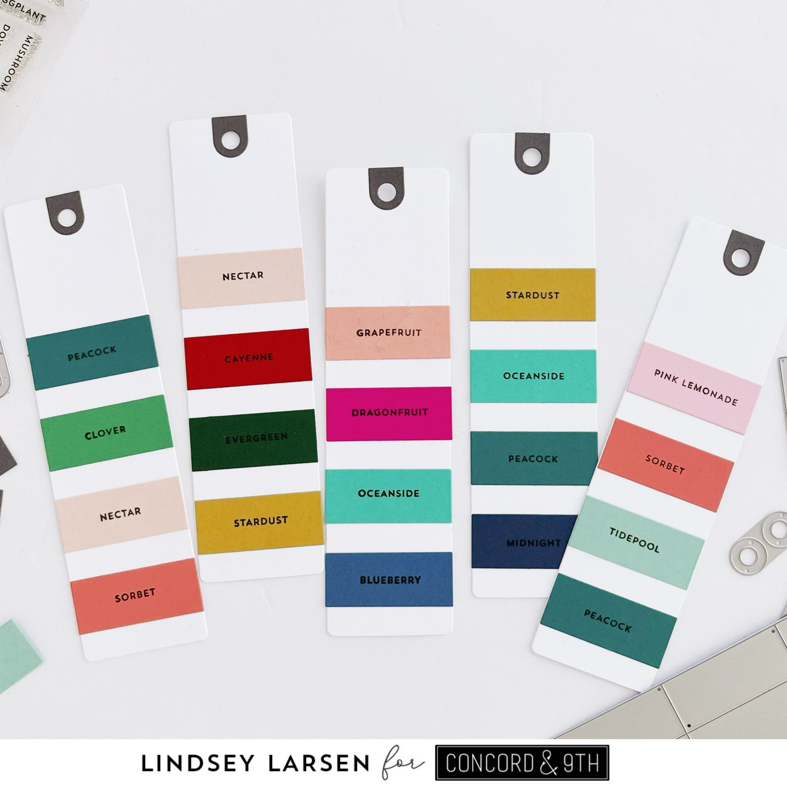
Okay, I also wanted to point out my first two swatches.  (Promise I won't be so wordy later on in the post!) I love color, and lately I have been using a lot of colors together on my cards.  The Swatchbook Bundle is designed to easily created swatches of up to 6 colors - 8 with no spacing.  Lately, though, I have been using 10 or so colors on a card.  I found that if you you use the "Spacer 1" die for your color block and then the "Spacer 2" die in between, you can still create a lovely, evenly spaced color swatch with 10 colors.  Happy sigh.  
My first swatch is a bright rainbow (Fig, Dragonfruit, Clementine, Buttercup, Sprout, Clover, Oceanside, Aqua Sky, Blueberry).  The second swatch I lovingly call the "Dawn".  Dawn McVey is one of the most inspiring people I know--in art, cardmaking, faith, and just life in general.  I have loved and admired her for years!  And if you know her, you know she LOVES color (and flowers!).  One thing I love about her eye for color is that she surprises me, combining things that I wouldn't necessarily have put together.  
This swatch was inspired by this painting of Dawn's.  (Please spend some time checking out her paintings.  Your eyes and heart will thank you!) But I have seen her use this combination of colors in other paintings and cards as well. Isn't it great?!  (Poppy, Carnation, Sweet Pea, Dragonfruit, Oceanside, Aqua Sky, Parsley, Avocado, Stardust, Honeycomb)

Now for the rest of my swatches + some tips I've learned along the way scattered throughout.
Tip 1: Use the MISTI (or something with a raised edge) to easily align swatch rectangles.  I placed my swatch in the MISTI right up against the bottom and side bar.  That way I could slide the color rectangle over until it butted up against the edge.  This easily keeps the swatch alignment straight along the edge. 
Tip 2: Use (and reuse!) the spacers.  I cut three spacers in each size and reused them for all of my swatches.  They're still going strong! And they speed up the process because you don't have to take time wondering if you've spaced things evenly.  They are especially important if you choose to stamp the color names in the white spaces instead of on the color swatch.
Tip 3: If using four or fewer colors, I started my swatch at the bottom leaving the most white space at the top.  Why?  Because when you fan out your swatch book, you see the bottom of the swatches the best because there is less overlap. 
Tip 4: Don't forget, you don't have to use cardstock.  You can use the Swatchbook Stamp Set to stamp swatches.  If you are like me, you probably have more inks than cardstock colors.
Tip 5: Stamping color names on your swatch rectangles first speeds up the process.  This is especially helpful if you want to create a whole bunch of swatches at once or just have things ready to go when inspiration strikes.  That way all you have to do is grab and glue. 
Tip 6: Take note of inspiration everywhere!  For instance, the second swatch below (Honeycomb, Blueberry, Tidepool) was inspired by a child's shoe.  The fourth swatch (Spiced Cider, Juniper, Black) is from the furniture/cabinet colors in a gorgeous living room.  The last swatch was from a bouquet of flowers.  Don't forget to go back and swatch color combos that you've used and loved before.
A note: The middle swatch below (Tidepool, Juniper, Cayenne, Nectar, and Nutmeg) has the most beautiful earthy colors, but try as I may I could not get it to photograph well. The Cayenne looks too red here.  If you purchase one of the cardstock bundles or ink bundles, pretty please put those colors next to each other, so you can see for yourself.  :) Thanks!  
Bonus Tip: If you like to use dark card bases, consider cutting a few of your swatches in black (or another favorite dark color), so you can see how the colors will look with a darker base. 
 
Thanks for sticking with me!  I hope this post has been helpful to you.  You can pick up the Swatchbook Stamp Set  + Dies and all the gorgeous new inks and cardstock over at Concord and 9th now! 

Monday, April 10, 2023

Concord & 9th Color Release Insta Hop

Good morning!  To say that I am excited to be joining Concord and 9th for their brand new color release would be a huge understatement.  I have been happy dancing for a month!  And if I'm being honest, some happy tears were shed as well.  Today's cards are part of a big Insta Hop going on, so make sure you head over to my Instagram account, so you can join.  There are so many incredible projects being shared and giveaways at every stop.  You do not want to miss out!

I can't tell you how much I love the new colors!  I have been swatching my little heart out and having the best time doing it.  Today we were supposed to share a favorite color combination.  It was so hard to choose!  I have lots of favorites!  So naturally I chose a color scheme with lots of colors. :)  Seven to be exact.  
To create my card, I pulled out the new Mod Turnabout Stamp Set.  I only did 3 turns on the turnabout, but I used 5 colors.  One one turn I inked the entire thing with Oceanside ink.  On the next turn I inked up some with Avocado and some with Lemongrass (two of the new greens).  On the third turn I used Aqua Sky and Blueberry ink.  I just love how the old and new colors fit seamlessly together!
Instead of doing the final turn, I had some fun with the pattern and added Carnation and Sweet Pea dots in various sizes in the open spaces. (The dots came from the Sweet Bee Dies and extra dots from the "i" in the sentiment.) 
Speaking of the sentiment, I cut one of the fabulous new Just Say More Dies in Blueberry Cardstock and framed it with Sweet Pea and Carnation flowers cut with the Sweet Bee Dies.
Before I move on to the next card I have to make note of the color swatch itself.  I made it using the new Swatchbook Bundle, which I think you are going to LOVE!  I'll be sharing more about it in the coming weeks, but suffice it to say that it is worth every penny.  The paint swatch lover in me is in color heaven!

Okay, while I had all my supplies out, I decided to make a second card.  I used all of the same colors, but this time I did four complete turns with the Mod Turnabout Stamp.  On the last turn I added in Carnation and Sweet Pea inks. 
With a busy pattern on the card base, I decided to keep everything else simple.  I used the Markered Messages Dies for the sentiment, cutting it each letter with Sweet Pea, Carnation Aqua SkyOceanside, Blueberry, Avocado, and Lemongrass cardstock.  
Then I added a few of the smallest hearts from the Just Say More Dies
Well, that's it for me today.  Thanks so much for stopping by!  
Don't forget to pop over to Instagram to join the hop.  I would love for one of you to win the giveaway!  And you can check out Concord and 9th's full release here.  You are going to love it all!  Wishing you the most wonderful week, friends!