Friday, October 29, 2021

Concord & 9th Feature Friday + GIVEAWAY

Hello! It’s my final Feature Friday with Concord and 9th.  I’ve had so much fun creating with these fabulous products and am astounded that the month has come to an end. This week is extra special because Concord and 9th has so generously offered to GIVEAWAY a $25 gift card to their shop. **Head over to my Instagram to enter to win it!** (PS Each of the designers will be hosting a giveaway, so you have lots of chances to win.)

Today I am sharing cards featuring two bundles.  First up is the Simple Seasons Bundle.  I pulled out the "it's fall y'all" sentiment and stamped in kind of randomly on my card base in graduating colors - ballet slippergrapefruitstardust, and sea glass.  I opted not to use a misti because I wanted the background to be playful.  

Next, I pulled out the Simple Seasons Dies and cut out the pumpkin, pie, and leaf images...perfect for fall!  I decided to use a second sentiment from the set, and embossed it on stardust cardstock.  I die cut it using the little banner in the set, but I shortened the length by die cutting it twice to trim off some of the excess length.  It such a simple alteration, but it made a huge difference to allow the images to stay visible.    
My second card highlights the Say Thanks Bundle.  I'll switch things up and chat first about the sentiment and then I'll chat about the background.  The first thing I noticed in this bundle was the large scripty thank you (+ outline) in the Say Thanks Dies.  I knew I had to use it, so I cut the outline with grapefruit cardstock and layered a white "thank you" on top.  

Another fun feature about this bundle is that you can cut individual sentiments from the Say Thanks Turnabout Stamp Set with a variety of speech bubbles included in the dies.  I stamped a sentiment from the Say Thanks Turnabout Stamp Set in sea glass ink and finished off my focal trio by die cutting and layering two little hearts included in the set. 

I created my background again using the Simple Seasons Stamp Set, inking up four images in ballet slippergrapefruitstardust, and sea glass inks.  Creating stamped backgrounds is one of my absolute favorite things to do!  I popped up my focal trio, and the card was done.  Easy peasy!  

Thanks so much for joining me today.  Don't forget to pop on over to my Instagram to enter in to win the Concord & 9th gift card!

Sunday, October 24, 2021

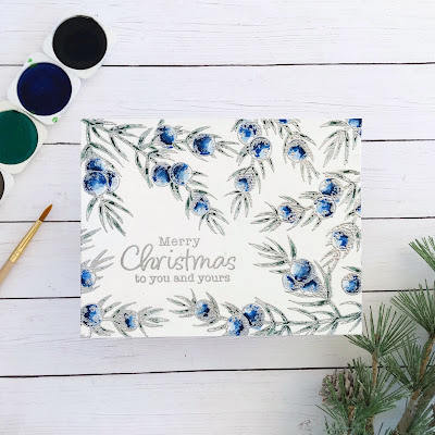
Watercolor Christmas with Technique Tuesday

Technique Tuesday is doing a "Watercolor Christmas" feature today, and I am happy to be joining along.  I am certainly at the beginner level for watercoloring, but hopefully this project will help inspire you to pick up a paintbrush and just go for it.  

One thing I've learned is that embossing helps me a lot when I watercolor.  I don't execute the loose feel very well yet, so embossing my images really helps me.  Bounds are set, and I simply have to work within them.   I embossed this beautiful Joyous Juniper Stamp Set from Technique Tuesday in silver several times to cover my cardfront and frame a sentiment from their Classic Christmas Sentiments stamp set. 


Then, I got to work watercoloring.  I have just basic supplies, so I mixed a few colors to create the shades I wanted.  Although I was tempted to do this card in bright reds and greens, I'm a lover of blue, so I embraced juniper's natural colors.  
The Greenhouse Society line of stamps from Technique Tuesday has beautiful images and the packaging comes with a colored image of the stamps.  This is really helpful to show where shading and highlights go when you are still learning this skill.  When I started watercoloring, I put a light layer of color down on the images, and then I went back in with deeper shades of the blues and greens.  I added and added until I was content.  And when it was dry, I went back in and added a little more. ;) Obviously I was going for a bit more dramatic look here and not subtle shading.  I loved the contrast of the deep colors against the shiny silver embossing.  

Thanks for stopping by today!  You can find lots more wonderful stamps in the Technique Tuesday Christmas Collection here. I hope you'll check it out and give watercoloring a go this week.  Whether you are experienced or not, it's a lot of fun!

Saturday, October 23, 2021

PPP Insta Hop - Village Ornament

Good morning!  Today I'm joining Pretty Pink Posh in an Instagram Hop.  I'm a big fan of making Christmas tags that can double as ornaments, so I decided to do that for my project today.  That being said, this tag is 4.25" in diameter and could easily be created as a shaped card instead.  

To prep my tag, I cut out a large circle in a beautiful dark green.  Then I nestled two circle dies inside of eachother to create a frame and cut that in a glittery gold cardstock. For the top of my ornament, I simply used the curved leftover piece of gold cardstock and trimmed out an ornament cap shape. Now onto the decorating!

Pretty Pink Posh's October release has SO MANY amazing products, and one of my favorites is the Village.  It is extra large in scale, and easily fills an entire A2 card.  For today's project, I opted to focus on just one image in the set.  I selectively inked up the church, embossed it, then die cut it with the Village coordinating dies.  The die cuts the entire village as a group, so I just fussy cut the left edge of the church since I was only using that one building.  

I was absolutely delighted when I saw the Holiday Scripts stamp set and knew I wanted to use that for my sentiment.  I have been enjoying these scripty sentiments with coordinating dies throughout the year in various sets, and I LOVE that this is an entire sentiment set in this style.  I embossed my sentiment in white on the same green cardstock, then die cut the "Joy" using the Holiday Scripts dies.
At this point all of my tag pieces were ready, but I thought that it needed just a little something extra.  An embossed Poinsettia Corners on the tag base was just what was missing.  It created the perfect backdrop to pop up the church on. It also balanced the white embossed sentiment on the opposite side of the tag.

Thanks so much for visiting today!  Make sure to pop over to my Instagram account, so you can enter in the contest.  You'll find all the details there, but Pretty Pink Posh will be chosing a gift card winner for each day of the Insta hop, so you definitely don't want to miss out.  Have a happy weekend, my friends!  

C9 Calendar Take Two

Hello!  I'm back with my second calendar set.  (You can find the first here.) I wanted to show you another option for Concord & 9th's 2022 printed calendars.  They have some products this month that coordinate perfectly with their calendars like the Simple Seasons Bundle and the Triple Step Floral Frame.  
On this calendar I decided to use the Triple Step Floral Frame, but I simplified it even more by using just the leaf frame stamp.   I fully intended to use all the stamps, but after stamping just the leaf frame for each month, I loved the fresh, clean look.  Lots of white space...mmmm. :) 

Like my previous calendar you need just a few supplies to bring this all together.  I used the 2022 Printed Calendars, the Tall Type Alphabet dies (love these!) and Triple Step Floral Frame.  Then I chose a color combination that I absolutely adore - grapefruit, sorbet, stardust, oceanside, peacock, and  midnight. 
This comes together in no time if you have a misti.  Simply align the leaf border in the Triple Step Floral Frame and stamp away.  I did two months in each color.  

Next, I die cut letters.  I didn't want to waste my precious paper, but it would really speed up the process if you ran the whole alphabet (mine is still wired together) through with one cut, then just cut the duplicate letters you may need. 
Now, in all honesty I first intended to make these monochromatic, but then I realized I hadn't paid attention to the dates on the calendar when I was stamping the frames and cutting the letters for each month, so they didn't match up. (Yeah, make sure you look at the 12 month guide they include in the package...) So I decided to embrace my mistake and mix and match everything.  No two months is exactly alike.  
In case you are intersted in the particular colors for each month, I'll break it down for you.
January - Midnight Ink | sorbet cardstock

April - Stardust Ink | Oceanside Cardstock

For the next set: 
July - Peacock Ink | sorbet cardstock
September - grapefruit ink | Stardust Cardstock
October - sorbet ink | Oceanside Cardstock
December - sorbet ink | Midnight Cardstock
And there you have it. I'll hope you'll give these calendars a try! 

Friday, October 22, 2021

Concord & 9th Feature Friday - Calendars!

Hello and welcome!  I'm back for second Feature Friday this month with Concord and 9th.  This week we are featuring their 2022 Calendar Bundle.   They are 5x7 pre-printed calendars that stamp beautifully.  It's no surprise that I love clean and simple, but that especially goes when it comes to calendars.  I want lost of space to write if needed, so I kept both of my calendar designs very simple.  Plus, I wanted to show you that this does not have to be a major undertaking, so it's very doable to mass produce as gifts and such.  
I've had an idea stirring in my head for a few months and now seemed like the perfect time to use it.  I've seen rainbows on clothing and home decor in any number of color combinations, so I decided to create a "Rainbows All Year" calendar with all the color schemes I've been dreaming up.  (FYI, my husband was definitely not sold on the idea, but I assured him it would turn out better than he thought and I happened to know a little girl who would think it's great.)

Just a note before we get started.  Make sure when you pull the calendars out that you pay attention to the printed dates.  There is a page that shows all 12 months, which is really handy to make sure you are working with the correct month. They come packaged in the correct order, but if in the creative process you forget all about that and start grabbing and mixing and matching things, you may want to double check every now and again.  Just sayin'.  I may or may not have had to rethink my entire design on my second set of calendars because of this.  

Okay!  Here we go.  To design my calendars I used just three things: Monthly Mix Stamp Set, Rainbow Stitches & Strings Dies, and oodles of Color Cardstock.
Though simple, using the additional stitching dies in the Rainbow Stitches & Strings Dies creates a considerable amount of interest to the rainbow.  I love it!  I chose colors that roughly matched the season or holiday that resides within each month.  
I kept the design consistent throughout, stamping the month with the Monthly Mix Stamp Set in the color that is the center arc in the rainbow.  So for February, I used honeysuckle ink.  
I'll show a few more examples, and then I'll give you the whole line up with my color choices.  I sure love Concord & 9th's color line!
Okay, here we go! 
January - doveoceansidemidnight
February - poppyhoneysuckleoceanside

And the next set: 
September - midnightwheatsorbet
October - peacocksorbetstardust
November - mushroomstardustdove
December - poppysea glass, clover

One last shot of them all together because those shots are my favorite. :) 
I actually made two calendars, so I'll be back in a bit to show you the next one.  Make sure you also go check out all the designers calendars on the Concord & 9th blog.  You're in for a treat!

Friday, October 15, 2021

Concord & 9th Feature Friday

To say that I am happy to share today's projects with you would be a huge understatement.  I'm absolutely delighted!  This month I'm honored to be a guest designer for Concord and 9th - a company near and dear to my heart.  (I guess that's what happens when you get to meet the people behind the company...such good people!) 

Today we are featuring the new (and amazing!) Triple-Step Floral Frame Bundle and the October Card Front Die Bundle.  I quickly fell in love with these products, so I made a bunch of cards.  I've got lots to share today, so lets get started!  

Funny enough, as soon as I saw the Quilted Card Front Die  (one of the sets in the October Card Front Die Bundle), I thought Christmas.  I just had to make a Christmas plaid!  

The die made the process super easy.  I simply cut 1/8" strips in PoppySprout, and Clover cardstock, and then used the stiched lines from the die to guide placement when I was gluing them down.  

I decided a big, bold sentiment was the way to go, so I stamped "merry & bright" from the Ornamental Stamp Set and fussy cut it out.  I also paper pieced one of the little holly clusters from the stamp set using clover and poppy carsdstock.

I wanted to make a companion card and was convinced I could turn Triple-Step Floral Frame into a Christmas design.  The design of this set is truly amazing.  The entire floral frame is achieved in three steps, but only two stamps.  I stamped the leaves in Clover Ink.  Then I stamped the flowers in Poppy Ink, flipped the stamp upside down, and stamped again,  (By stamping twice - once right side up, once upside down you fill in all the flowers in the frame.)

The Triple-Step Floral Frame Bundle also includes idividual flowers and leaves, so I stamped and die cut a few of those to add some dimension to my design.  I stamped the extra leaves in Sprout Ink and popped up just 4 of the flowers.  I chose a sentiment from the Snow Flurry Stamp Set, an oldie but goodie.  
I used the scalloped frame in the Triple-Step Floral Frame Dies to cut the entire panel out and popped it up onto a Clover cardstock base that I had cut with the Stitched Stripe Card Front Die.
I was still mulling over colors/design for my next card set, so while I was thinking I just started stamping for fun.  I hadn't planned on sharing this next card, but in the end I figured, why not?  It's a true one layer card, but I used the scalloped frame in the Triple-Step Floral Frame Dies to make it a fun shaped card. 
I used Sprout Ink for the leaf layer, but while it was in the misti I went back and stamped the corner leaves a second time in Clover Ink.  Next, I stamped the flower layer in Oceanside Ink, flipped it, and stamped it again in Ballet Slipper Ink.  I left it in the misti, inked up just a few of the little fowers in Poppy Ink and stamped again.  Then I stamped some of the flower details in Poppy.  I wanted the dark green color scattered throughout the design, so I used a marker to go back and color over just a few of the light green dots.    
Okay, after I finished the last practice card, I was ready to go for my final design.  The colors I chose were OceansidePeacockMidnight, and Stardust.  I've gott a say I love how these turned out!

I used just the Triple-Step Floral Frame stamps on this one.  Midnight ink is a deep, deep navy, and I used that to stamp the leaves.   The flowers are Oceanside and Peacock.

I used a partial sentiment from Triple-Step Floral Frame ("sending") and then finished it by stamping hugs with the Bold & Brushy Stamp Set in Stardust Ink. I really appreciate how alphabet sets allow me to create any sentiment I want, especially when I have a recipient in mind when I'm creating the card.  

My final card features the Quilted Card Front Die.  It makes a beautiful stitched background, and I wanted to highlight that a bit more.  I found some dark teal floss in my stash that matches the peacock color almost exactly and stitched a diamond shape using the quilted lines.  

Then I die cut all the pieces in Fresh Cut Florals Dies Edition 1 twice using Oceanside and Peacock cardstock for the flowers, Midnight for the leaves, and Stardust cardstock for the berries and flower center.   Actually, I cut the flower center 4 times to give it more dimension.  

I flicked some really old Heidi Swapp Gold Color Shine Spray on the flower petals.  They shimmer beautifully!  Then, I built my flower, putting foam tape between each of the layers, so it has lots of dimension. 

Finally, I tucked the leaves and berries in, and added a sentiment strip using a sentiment from the Painted Peony Stamp Set.  You can't go wrong with any of Concord & 9th's sentiments.  The fonts are always beautiful.  

Did you manage to make it here? I'm curious...do you have a favorite project.  Here's a quick peek if you need to refresh your memory after such a long post.  Lol.

Thank you bunches for visiting today!  I hope you'll check out the other projects the designers made this week on the Concord & 9th Blog.  I'm humbled to be among this bunch.  And don't forget to check out the entire new release at Concord and 9th.  SO MUCH to love!  I hope you are headed into a lovely weekend, friends!